Visual Communication Design— Information Design Project 2
Going into Project 2, we started looking into how the visual presentation of the text affects the audience’s understanding of content. To more deeply understand the different aspects of using typographic variables, we conducted a series of exercises to present text that is provided for us as a poster and mobile screen. The topic I was given was a one week Keanu Reeves showing at Row House Cinema, a movie theater in the heart of Pittsburgh’s Lawrenceville neighborhood.
To better understand the content given to me, I did some secondary research about Row House Cinema and what kind of theater it is as well as visited the actual theater. Additionally, I also looked into the Keanu movies that were showing to see what kind of colors are present in the different movie posters.


The first exercise of only using line spacing, stroke weights, and horizontal shifts to compose the content was interesting because I didn’t think that there could be so many different ways to layout the content just by changing such simple aspects of the typography. The second exercise of using all the previous variables as well as scale started to introduce a more prominent hierarchical structure. For example, in the most right poster below, Row House Cinema presents is scaled bigger and is intentionally done that way to draw readers to the title at first glance.


The third exercise brought color in and at this point, I wanted to use colors that are normally associated with movie theaters like red, black, and yellow. I also started manipulating the text, even more, to expand to the edge of the page or move the text to interesting parts of the poster. One piece of feedback I received was that if my posters were to be posted on a bulletin board surrounded by a sea of other similar colored posters, they probably wouldn’t stand out as much. This got me thinking about context and how in my next iteration I should experiment with other colors. Creating a mobile version also got me thinking about how physical and digital mediums have pretty different things that should be kept in mind when designing. For example, for the poster, I had a lot of space to use to create interesting shapes with text and color. While, for the mobile version, there wasn’t much flexibility with what I could do with the width of the screen.


In the last exercise, using images really brought the content to life. Since we were only allowed to use one image per poster, I wanted to experiment with images related to both movies and Keanu. The left two posters below show objects that are usually associated with films or movies. I particularly liked the projector picture and the way that the light shines down for the audience to read from Keanu down to the location of Row House. I also tried using the film in the second poster as a way for the audience to follow their gaze from the top of the roll of film to bottom. In the two right posters below, I created a background in Photoshop from the green color used throughout The Matrix. I really loved the way the background looked on my computer but realized that the green probably wouldn’t show up as well as I would want if printed.


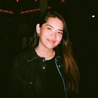
Even though I was very sold on the black/green Matrix-y background as a possible final background to use, I decided to continue experimenting with other images related to Keanu. Some of the feedback I received was that the lit side of his face is more intriguing to look at and take advantage of the negative space near Keanu’s face. As for color, based on the image that I chose I thought purple fit nicely with the background color. I also experimented with green to still bring in a reference to The Matrix. However, I decided to stick with purple because the green didn’t look consistent with the feeling of the image; green conveyed more a playful feeling which contrasts Keanu’s serious face. Another piece of feedback I received for the mobile version was that I should take advantage of the scrolling gesture for phones and use space in a more impactful way.


In the final iterations of the poster, I played with the big “Keanu” text color as well as adjusting the background image opacity to see whether that would enhance the text more. I chose to go with the first poster from the left below because expanding the “Keanu” off the page is interesting and might hold the attention of the viewer longer. I also chose to scale the “Row House Cinema presents” text because the text was barely readable from a distance during our critique session; I realized that other than “Keanu”, I also want readers to be able to see that this poster is related to Row House at a distance. For the final mobile version, I took the feedback that I received in the critique session to separate the title and movie information into two different sections. At the very top of the page, the user can first see what type of movies are being shown at Row House Cinema. Then, as the user scrolls down, they can see blocks of information relating to each Keanu movie.


Overall, I enjoyed this project because I was able to learn more about the different aspects of print design and how to incorporate typographic variables into how information is constructed. I thought the critique session helped me see how my poster compared to others. I was able to learn from my peers’ posters to see what kind of elements they used that were successful and evaluate the strengths/weaknesses of my own poster. One important takeaway that I had from the critique session was also to always test print. If I had test printed, I would’ve known better how the contrast between the purple and dark background would’ve looked and could adjust the design more.